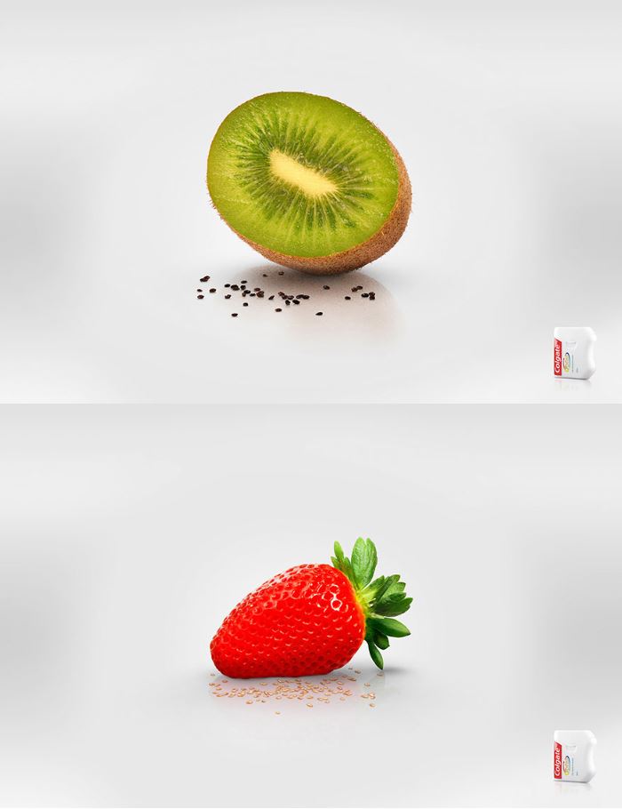
This ad is about Colgate Dental Floss. I found this ad at http://www.boredpanda.com in the article “33 Powerful and Creative Print Ads That’ll Make You Look Twice” by Lina D. The advertising agency who created this ad is Cerebro Y&R, Panama. It shows the four design principles: proximity, alignment, repetition and contrast. It also shows professional use of colors. I was impressed with this ad and Its simplicity and mastery of color use.
Proximity

It is important to group the items that are directly related. It helps create a nicer look to the page. It helps a more efficient visual communication. The kiwi seeds next to the kiwi and the strawberry seeds next to the strawberry are perfect examples of proximity.
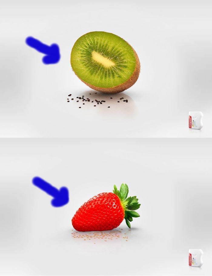
Alignment
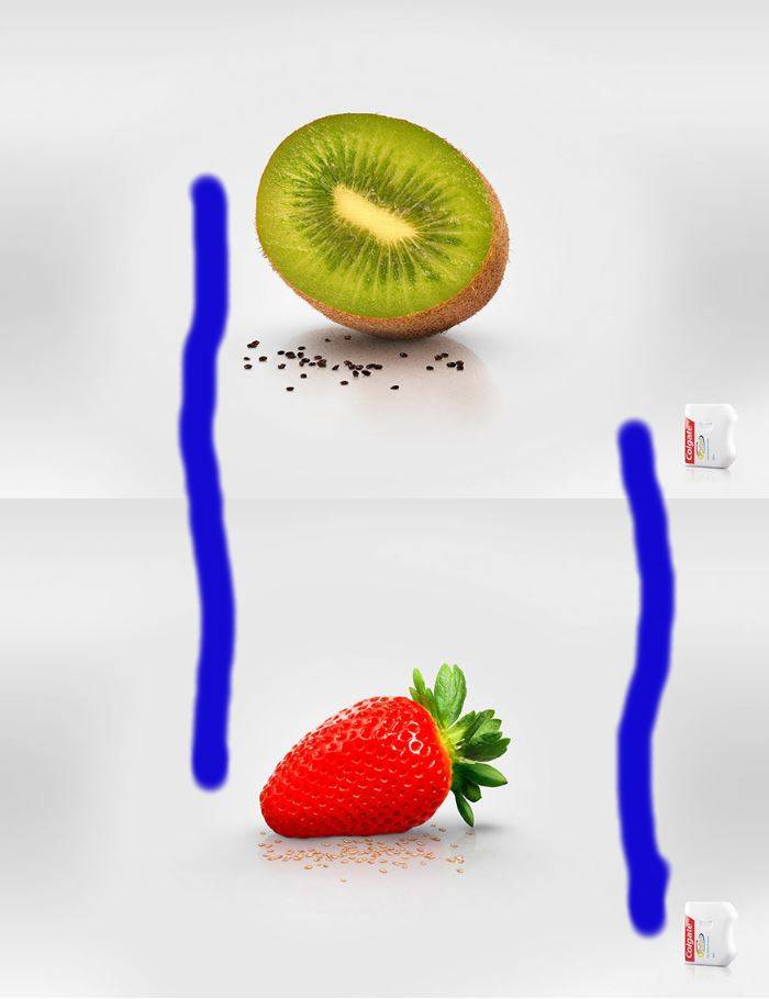
The kiwi and the strawberry, and the two dental floss packages are vertically aligned creating unity and organization. The author chose a vertical alignment and stuck to it. The picture looks unified and organized which is the basic purpose of alignment.
Repetition
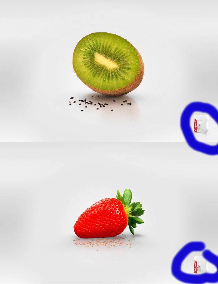
The element of repetition is encouraged in the visual arts and it helps tie separated parts. In this ad the author uses the two packages of dental floss to connect the pictures. The two pictures send one message because of the element of repetition, and it adds graphic interest. The repetition is not excessive but is enough to catch visual attention.
Contrast
I noticed two main elements of contrast. One is the big kiwi and big strawberry contrasting with the small seeds from both fruits. Another element of contrast is the light gray background against the bright green and bright red fruit colors. Contrast needs to be strong to create visual interest. The artist definitely got the element of contrast in this ad.
Colors
In visual media we need to be aware of the right use of colors. Primary colors yellow, red and blue are highly used for kids’ items. We reach harmony when we use related colors. In the well of colors, the opposite colors are complementary colors, like for example: blue and orange, red and green, yellow and purple. The author of this ad used the colors green and red as complements and achieved a great outcome.
Conclusion
It was really fun working on this assignment. I learned how to identify the four elements of design. Now when I look at an advertisement, I analyze it searching for proximity, alignment, repetition and contrast.
